
This project was a part of the Word and Image course taken by Jagadish Kumar at the National Institute of Design, Ahmedabad.
About ISRO
The Indian Space Research Organisation (ISRO) has expanded the possibilities of space research and raised public awareness and interest in space amongst Indians. It is known for its record of sending many satellites into space. ISRO's rockets are also known for being cost-effective, allowing the organisation to launch satellites at a relatively lower cost than other nations.
About the original logo
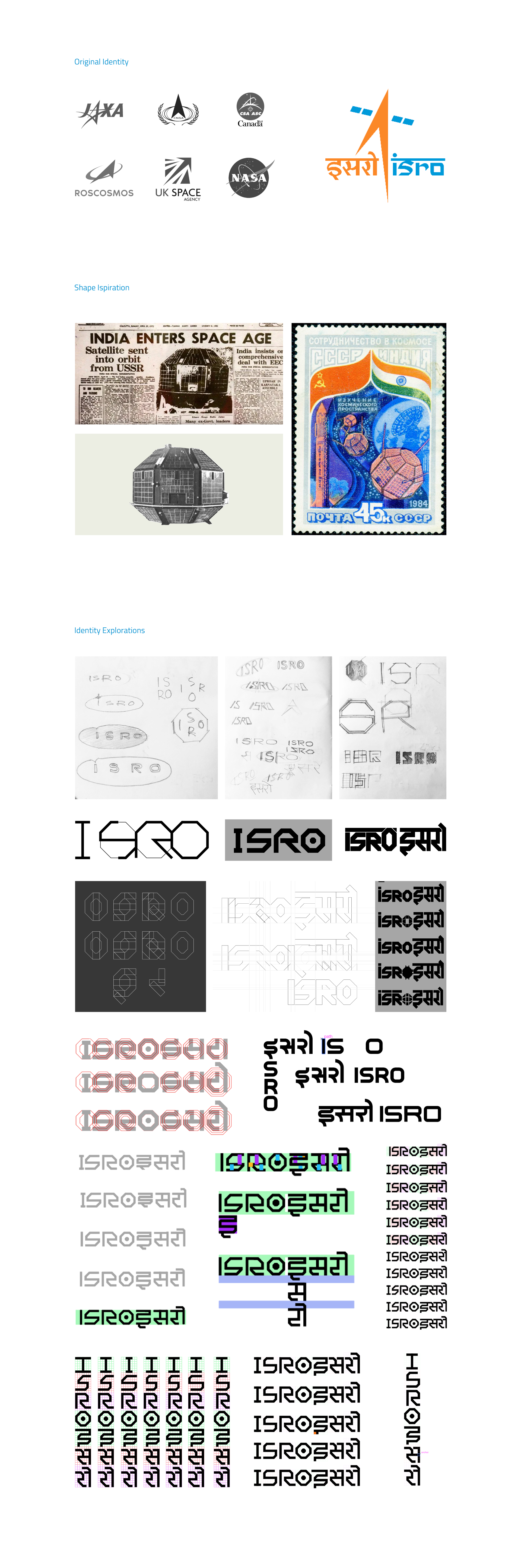
The ISRO logo is a combination of a bilingual word-mark in Devanagari and English, four solar arrays of a satellite, and an upward arrow launching into space. The colors orange and cobalt blue are used to represent ISRO's ambition and aspiration in space research and exploration. The logo is intended to depict the organisation's energy and vitality. The bilingual word-mark is written in the Prakrta typeface, which is a modern typeface inspired by traditional Indian scripts.
Why this re-design?
The current ISRO logo has all the correct elements but could be more cohesive. The Devanagari and English letters are similar in style but do not seem harmonious. The "o" and "i" look out of place.
The logo borrows elements from those of other space organisations, which makes it seem unoriginal and less reflective of its unique mission and values. For example, the upward arrow resembles NASA's "meatball" logo.
Additionally, the current logo needs some help with scale and proportion. It can be challenging to read in small sizes.
Inspiration
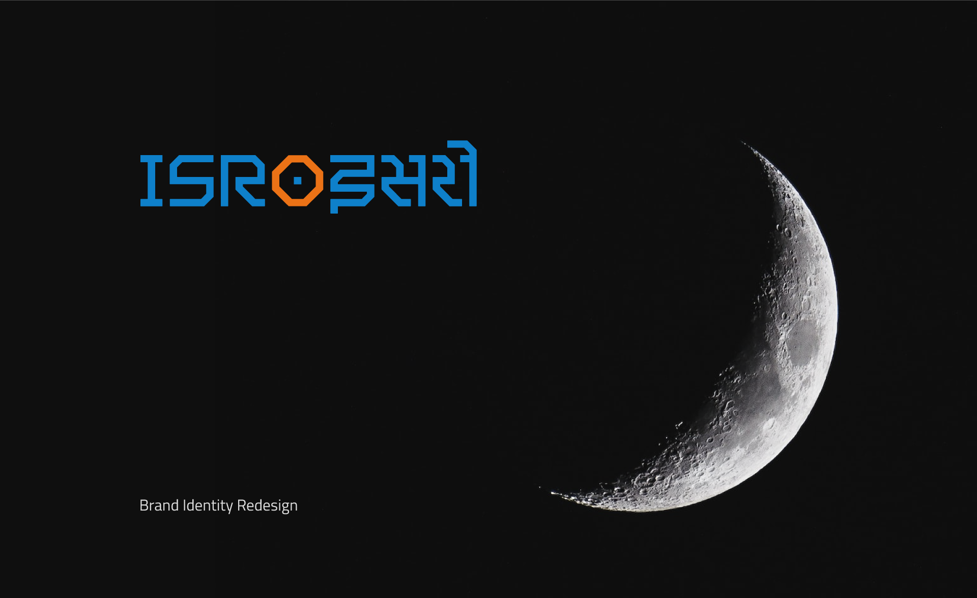
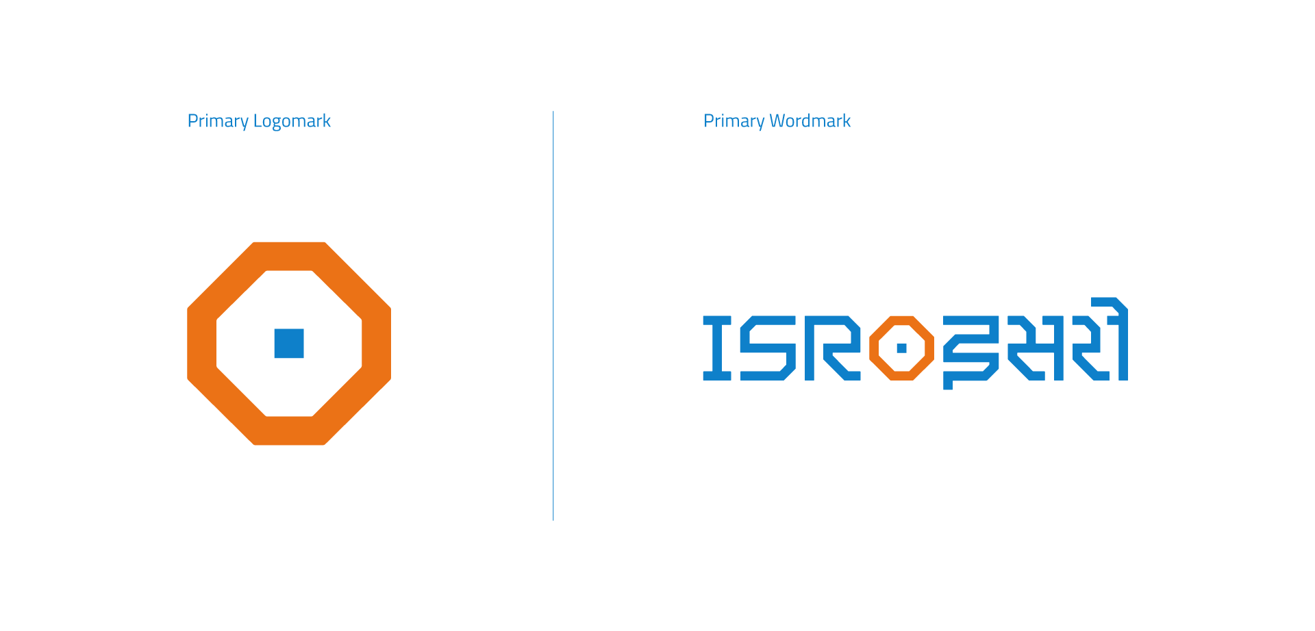
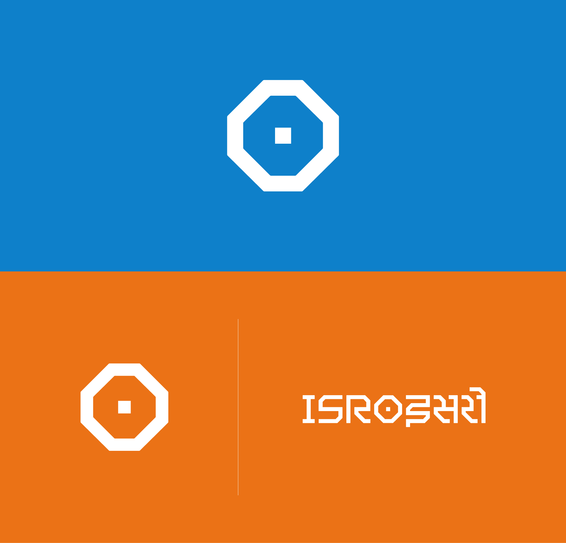
I researched more about the organisation's approaches to encompass the curious nature of ISRO's enquiries into the vastness of space around us and its objects with the help of its cost-effective satellites. I learned about its first satellite, Aryabhatta, which became the main shape inspiration for designing the word mark. Keeping the satellite Aryabhatta in the middle, which is carefully made into the 'O' of the Latin characters of ISRO, the rest of the characters carry the same angular characteristics. The Latin character 'O' here also refers to 5th-century astronomer and mathematician from India Aryabhata's invention and use of 'zero' in the decimal number system.
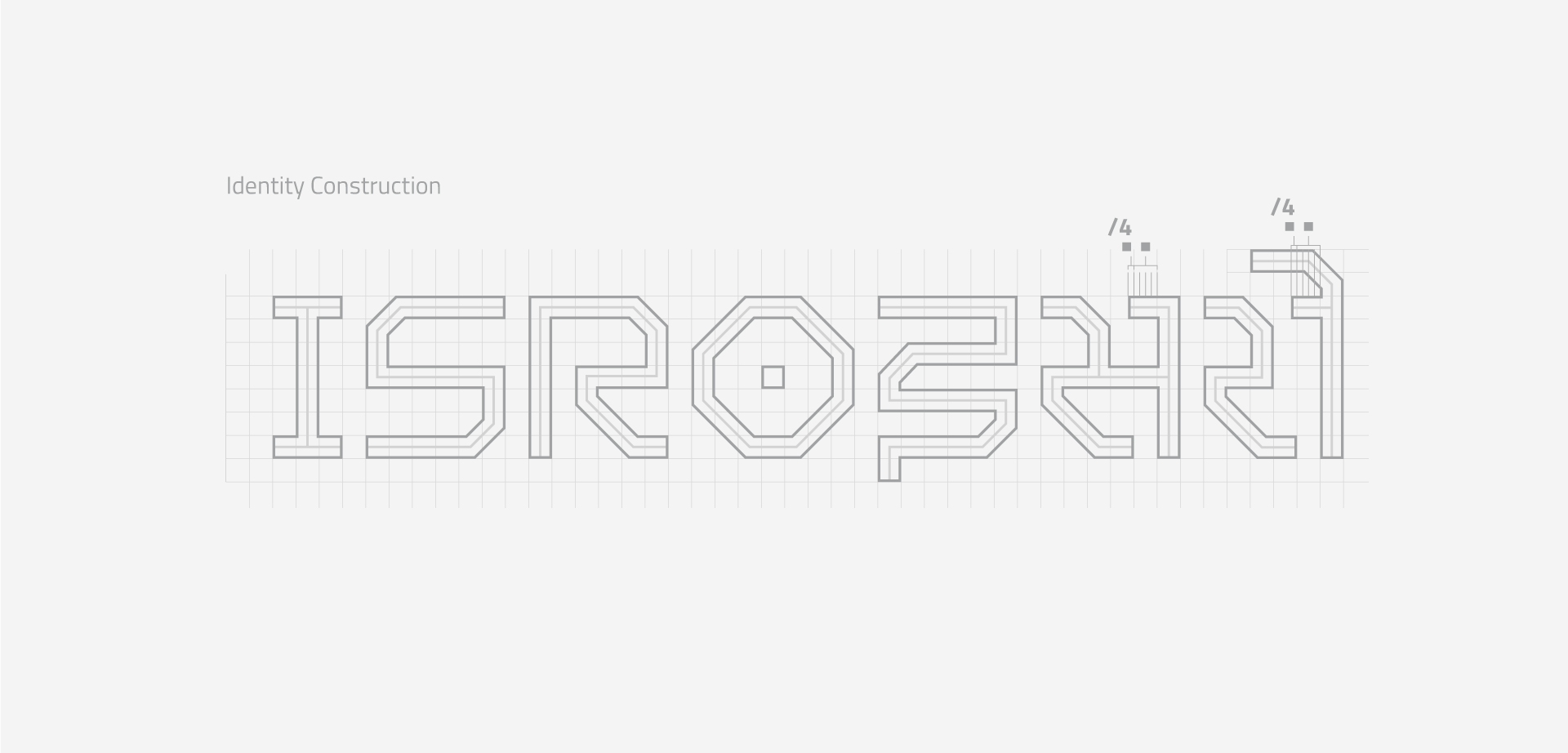
After exploring analogue sketches, I went to Adobe Illustrator to explore the word mark in vector. Creating the Latin characters was much more straightforward and linear than making the Devanagari characters because of their intricacies. The grids represent the precise measurements and readings that are performed in scientific research.
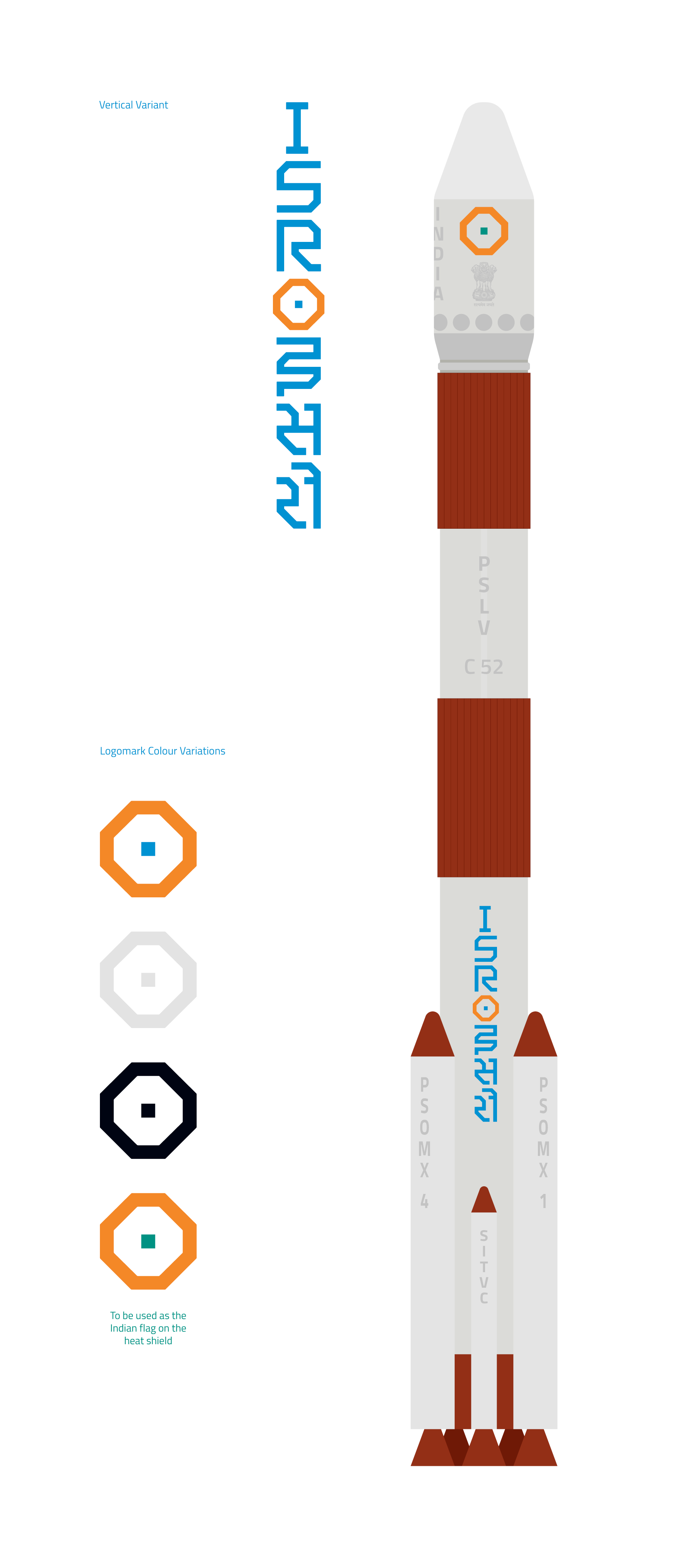
Construction
The word mark and the symbol are designed using a 7x7 grid. The single grid in the middle represents a chip, part of a solar panel, or the start of an inquiry that leads to a new expedition in search of answers. The characters are designed with a single expressive line with angular characteristics. This style is carried throughout the word mark.